Elite
Elite is a local food brand which handles a range of canned products such as baked beans, mushrooms, peas, tomatoes and tuna.
Elite was established during the 1960s and today, is one of the market leader’s in canned goods.

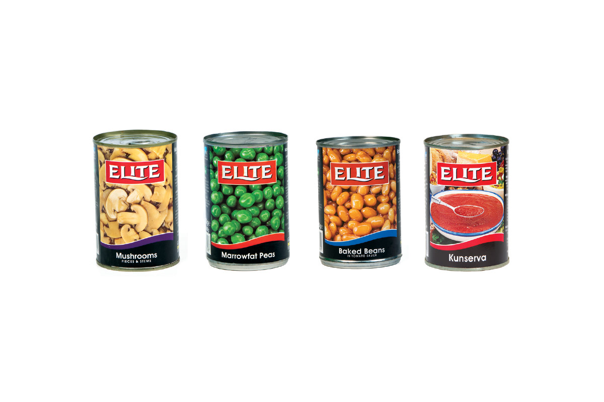
The objective was to give the brand an overhaul and create a more contemporary look, that will stand out on the shelves amongst other brands and competitors.
Outcome
A slick and clean look accentuated by the introduction of an icon integrated with the new logo. The icon is an adaptation of the letter ‘E’ to form a Maltese fort.
The use of the icon helps signify strength and leadership in the local market.
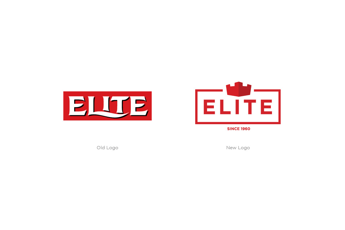
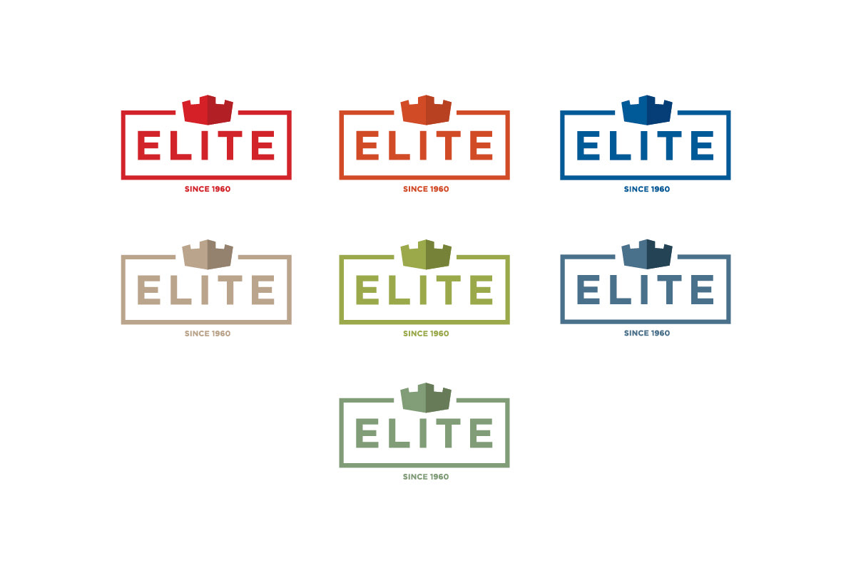
New logos
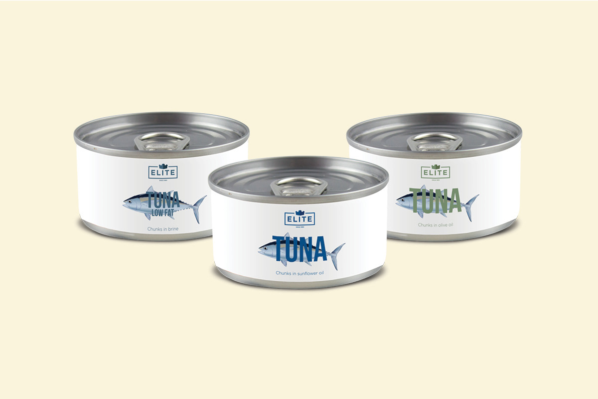
Each product features a different coloured logo, relevant to it’s nature and help give each individual an eye-catching look, whilst also keeping within the same family.
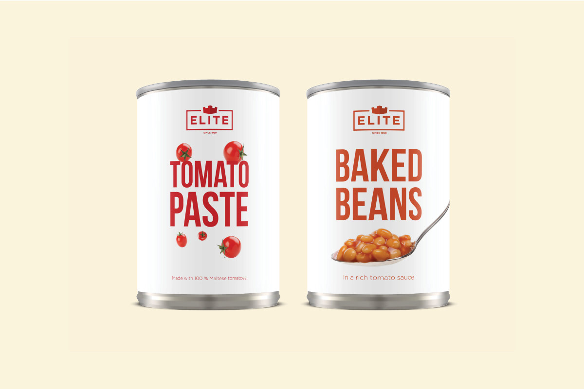
Packaging design
Each product contains a monochrome colour palette adapted on a clean white background. Bold typography is utilised together with specific imagery to help the packaging pop out and make each product one and identifiable instantaneously.